[WIP] Adds dark-mode support #757
Conversation
|
Any argument for or against it? (related: https://community.letsencrypt.org/t/allow-users-to-select-dark-mode-theme/105987) |
| pre { | ||
| padding: 8px 12px; | ||
| overflow-x: scroll; | ||
| overflow-x: auto; |
There was a problem hiding this comment.
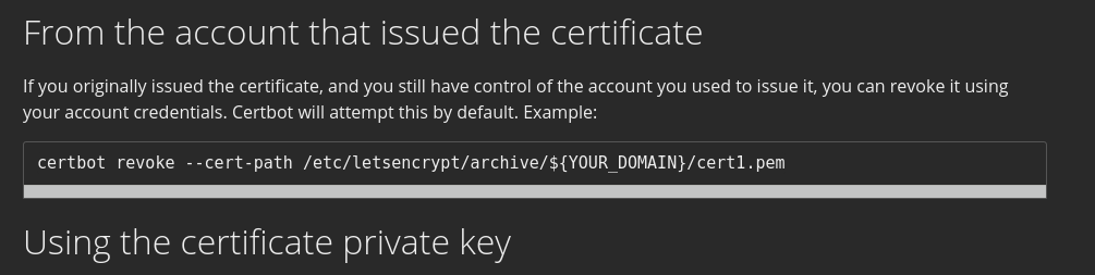
There is an always-visible scrollbar in code content even when the window is large enough: https://letsencrypt.org/docs/revoking/
That scrollbar is useless, and it became worse in dark mode:
|
This seems like a nice addition so long as it looks just as good as the non-dark mode. Thanks! |
|
I approve of adding dark mode in concept. I think this work-in-progress still needs a little work. Attached are a couple of screenshots from my Android device in dark mode.
Specific issues: The blue of the Let's Encrypt logo (and in the "LINUX FOUNDATION COLLABORATIVE PROJECTS" header) is a little dark to show up against a black background. We should probably lighten that. The brightness of the hero image feels a little jarring and out of place. Not sure how to fix this; probably it's best to just leave it alone. The sponsor logos are on a white background. This is unavoidable because a lot of the sponsor logos would be unreadable on a black background. But it's awkward looking because there are black lines between the logos. I think we need to put all the logos in a big white box. The "Donate" button at the botton has black text, while the rest of the text on the page has white text. Also, against the black background the blue color of the button feels over-saturated. Maybe match it to the blue used in hyperlinks? |


|
Also, I think the text in the "Get Started" and "Sponsor" buttons inside the hero image is too light. |
|
Bump |
|
@scottmakestech How hard would this be to do with the current website? |
I'll look into it. It seems doable. @bdaehlie |
|
I wouldn't say it's a high priority, but if it's not too much work it would be nice. |
Uses prefers-color-scheme to display in dark mode when asked by the browser/OS (https://caniuse.com/#feat=prefers-color-scheme)
TODO: