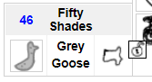
familiar brick renovation #16
Conversation
revised familiar brick to better display in more flexible sized bricks.

Also added grey goose support.
|
Sorry for the delay on this, got distracted by a variety of things. I'll have a look after work today! |
 soolar
left a comment
soolar
left a comment
There was a problem hiding this comment.
Overall I like how this looks with a narrow brick, but with a wider setup it definitely looks worse imo. The problem there is that I'm not sure if it's feasible to do some sort of responsive layout where it would switch to this display when the space available was small enough and go back to the other layout when wide enough in ChIT's codebase. If you can think of some way to do that I'm all for this.
Specifically the part I like about the current layout when the brick is given a wider amount of space is the familiar justifying to the left, the familiar equip justifying right, and the information being in the middle. With this change it goes familiar, equip, info, and all three are centered together.
I wasn't terribly fond of how the weight and familiar type name were moved to be right next to each other at first, but it has already grown on me. I AM also a big fan of the fact that this seems to have moved the mumming trunk icon to the top left corner of the brick instead of right next to the familiar name. I'll have to look in to doing something similar because that is so much better of a position. Although looking at the code I have no idea WHAT caused the mumming trunk icon to move...
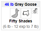
| case $familiar[grey goose]: | ||
| int famweight = familiar_weight(myfam); | ||
| info += famweight + " lb"; | ||
| int target = max(famweight+1, 6); | ||
| if(famweight < 20) | ||
| info += " - " + (target**2 - myfam.experience) + " exp to " + target + " lb"; |
There was a problem hiding this comment.
This seems of questionable value to me since all this information is already available, but at the same time it also seems harmless so I guess I'm cool with it. Not to mention it makes it available without having to mouse over anything, so I guess I can see how it would be useful after all.
There was a problem hiding this comment.
Yeah, I couldn't figure out a way to get it to put the familiar and equipment on opposite sides when there is enough room, or I would have done that to make it more backwards compatible. But honestly, I actually like having the familiar and equipment side-by-side better. What do you like better about the previous view? Do you think that providing an updated default layout that doesn't have a full-width familiar brick would be a fix worth considering?
I don't have a Mumming Trunk, so I didn't even know that it shows an icon on your familiar brick. It's lucky that the changes were an unexpected improvement. It might be something in the CSS rather than in the HTML.
The Grey Goose showing unbuffed weight and exp to next lb was a big QoL thing when I was running Grey You runs. I think it will be valuable information-at-a-glance to many users.
Description
Revised familiar brick to better display in more flexible sized bricks. Also added grey goose support.
Screenshots
Before:
After:
Checklist: