


![]()
pydiceplot draws dice plots: grids of die-face icons that encode up to
nine categorical variables (one per pip slot) plus optional continuous fill
and size mappings. It also ships a refactored domino_plot(...) API for
two-contrast feature-by-celltype panels. Both plot types share matplotlib and
plotly backends with seaborn-style entry points.
It's the Python sibling of the R package
ggdiceplot. The grid geometry and
legend stack are ports of
kuva's DicePlot, which is itself a
port of ggdiceplot::geom_dice — so all three packages produce the same
visual layout (with one intentional fix: n=6 is the traditional two-column
die face rather than ggdiceplot's transposed two-row layout).
pip install pydiceplotFor development against this repo:
git clone https://github.com/maflot/pydiceplot.git
cd pydiceplot
pixi install
pixi run test # run the test suite
pixi run example # regenerates the showcase images under images/
pixi run build # sdist + wheel in dist/
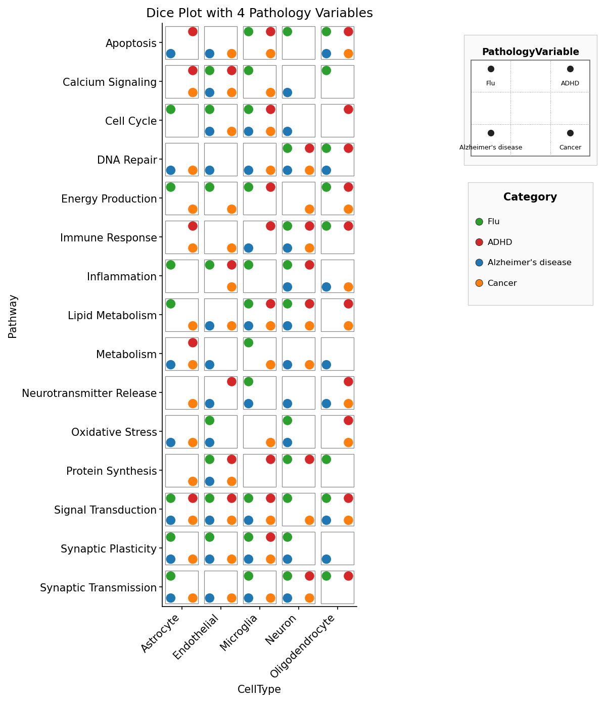
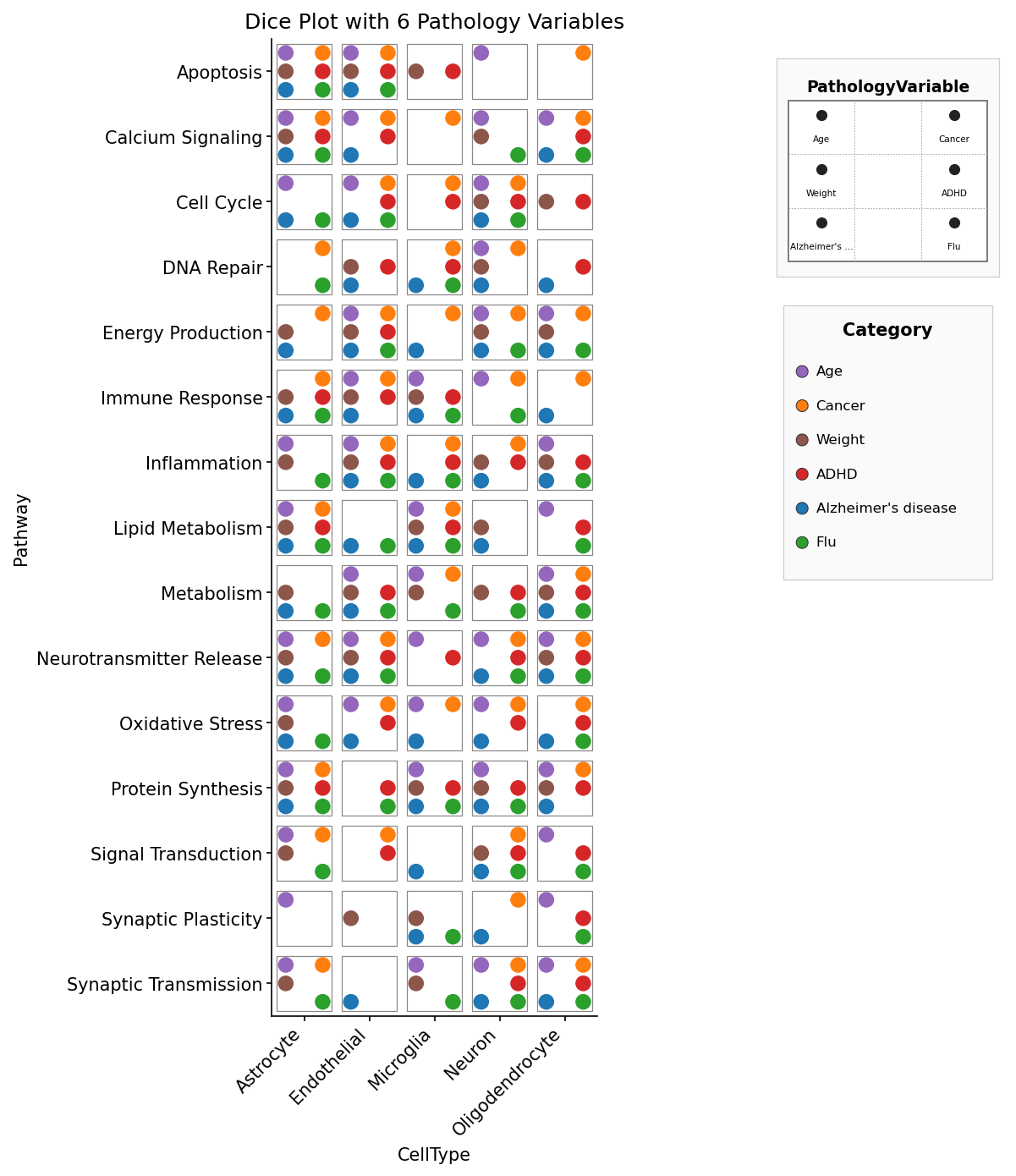
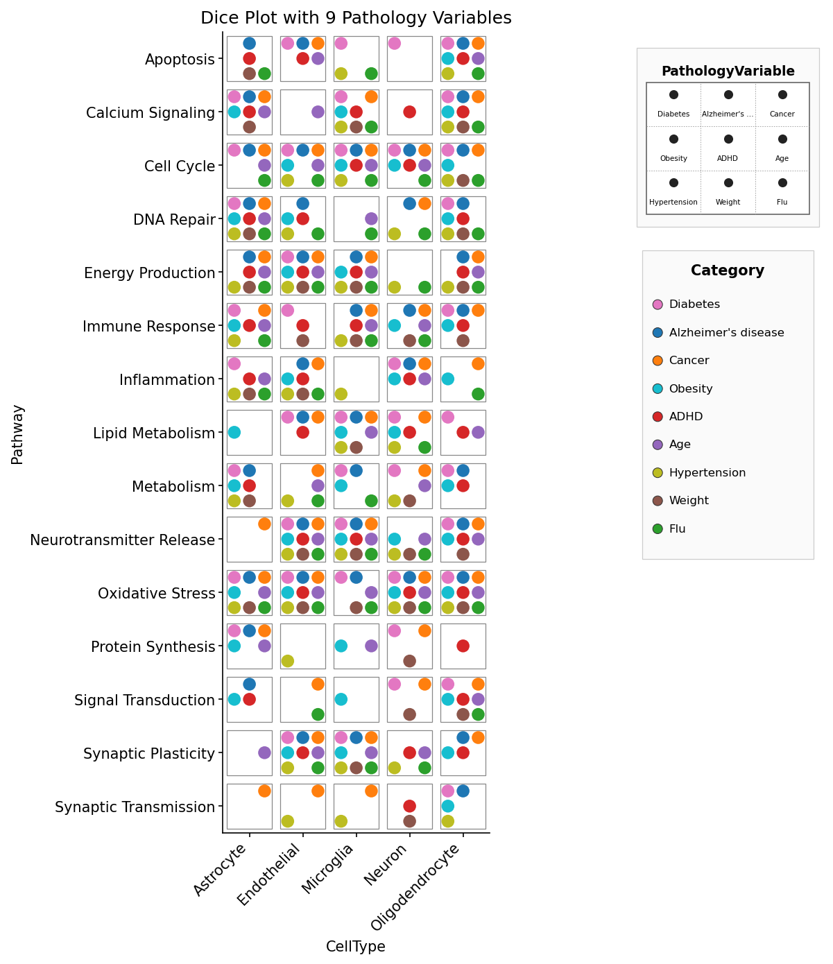
pixi run precommitCategorical mode — each pip is coloured by its pips value:
import matplotlib.pyplot as plt
import pydiceplot
from pydiceplot import dice_plot
from pydiceplot.plots.backends._dice_utils import (
get_diceplot_example_data, get_example_cat_c_colors,
)
pydiceplot.set_backend("matplotlib")
data = get_diceplot_example_data(4)
colors = dict(list(get_example_cat_c_colors().items())[:4])
fig, ax = dice_plot(
data,
x="CellType", y="Pathway", pips="PathologyVariable",
pip_colors=colors,
title="Dice Plot with 4 Pathology Variables",
figsize=(9, 10),
)
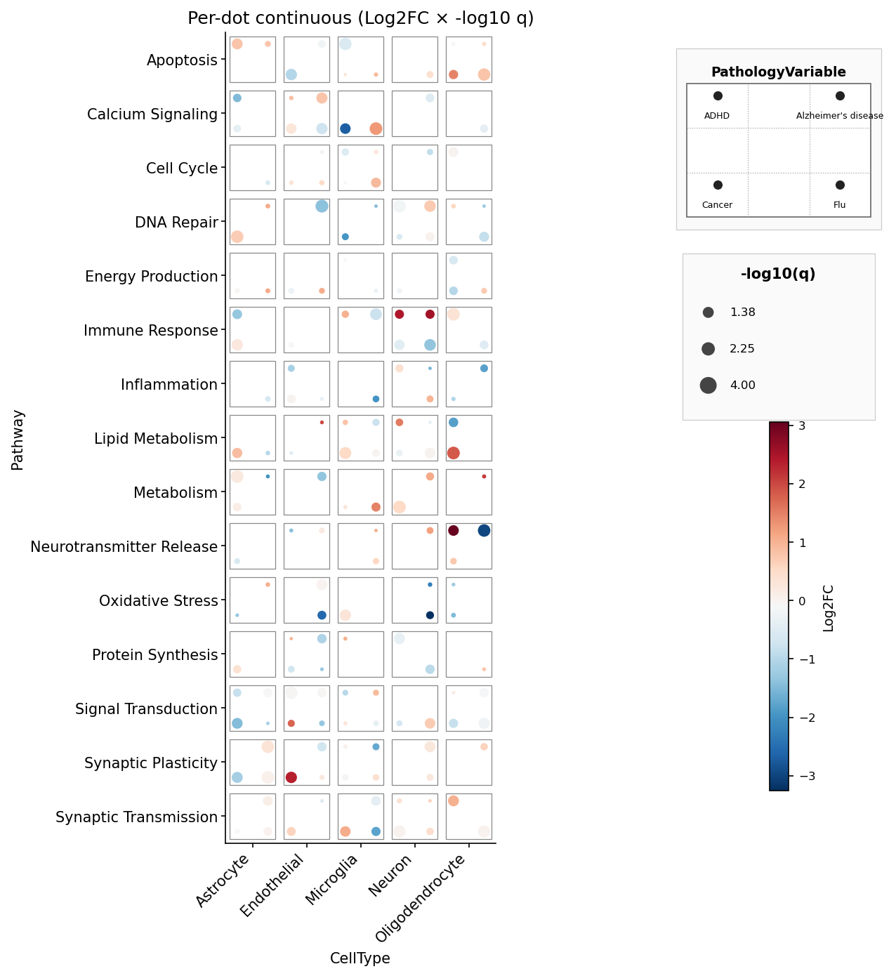
fig.savefig("dice_4.png", dpi=150, bbox_inches="tight")Per-pip continuous fill + size — mirrors ggdiceplot's
geom_dice(aes(dots=..., fill=lfc, size=-log10(q))) (we rename dots →
pips since the marks on a die are formally called pips):
import numpy as np
from pydiceplot import dice_plot

rng = np.random.default_rng(1)
data = get_diceplot_example_data(4)
data["lfc"] = rng.normal(0, 1.2, len(data))
data["nlq"] = rng.uniform(0.5, 4, len(data))

fig, ax = dice_plot(
    data,
    x="CellType", y="Pathway", pips="PathologyVariable",
    fill="lfc", size="nlq",
    fill_label="Log2FC", size_label="-log10(q)",
    cmap="RdBu_r",
    title="Per-dot continuous",
)
Plotly — same API, returns a plotly.graph_objects.Figure:
pydiceplot.set_backend("plotly")
fig = dice_plot(data, x="CellType", y="Pathway", pips="PathologyVariable",
                fill="lfc", size="nlq", cmap="RdBu_r",
                width=900, height=650)
fig.write_image("dice.png")
Drawing into an existing axes (skips the built-in right-side legend stack so you can compose your own multi-panel figure):
fig, axes = plt.subplots(1, 2, figsize=(14, 6))
dice_plot(data, x="CellType", y="Pathway", pips="PathologyVariable",
pip_colors=colors, ax=axes[0])
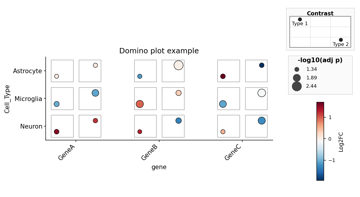
axes[1].plot(range(10))Domino plots use a matching column-first API. Each tile is a
(feature, celltype) pair with exactly two contrast slots:
from pydiceplot import domino_plot
from pydiceplot.plots.backends._domino_utils import get_domino_example_data

data = get_domino_example_data()

fig, ax = domino_plot(
    data,
    "gene", "Cell_Type", "Group",
    features=["GeneA", "GeneB", "GeneC"],
    label="var",
    fill="logFC",
    size="neg_log10_adj_p",
    contrast_order=["Type1", "Type2"],
    contrast_labels=["Type 1", "Type 2"],
    fill_label="Log2FC",
    size_label="-log10(adj p)",
    figsize=(9, 5.5),
)dice_plot has three input modes, picked by which arguments you pass:
| Mode | Trigger | What each pip encodes |
|---|---|---|
| Categorical | pip_colors={label: hex, ...} |
filled circle in its category colour when present |
| Per-pip continuous | fill="col" and/or size="col" |
continuous colour and/or size from numeric columns |
| Per-pip discrete | fill="col" + fill_palette={value: hex, ...} |
colour per discrete fill value; pip slot still comes from pips |
The legend stack on the right always includes a position legend showing
which pip slot maps to which pips value, plus a colorbar and size legend
when continuous mappings are active. That stacking matches
ggdiceplot::draw_key semantics.
Everything below is produced by example_code/example.py. Regenerate with
pixi run example.
The standalone domino example lives in example_code/example_domino.py.
Each script in example_code/ reproduces one of the figures from
ggdiceplot/demo_output/, loading the original R sample data exported to
CSV under example_code/data/.
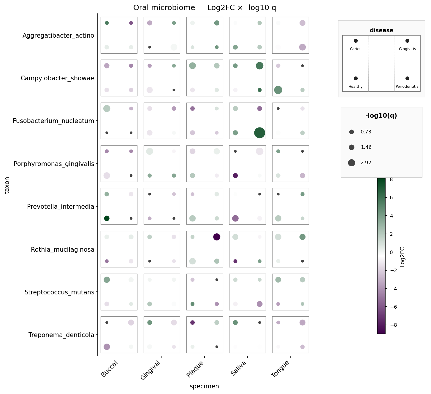
Oral microbiome — 8 taxa × 5 specimens × 4 diseases, per-pip Log2FC and
-log10 q. Mirrors sample_dice_data2 / example2.png.
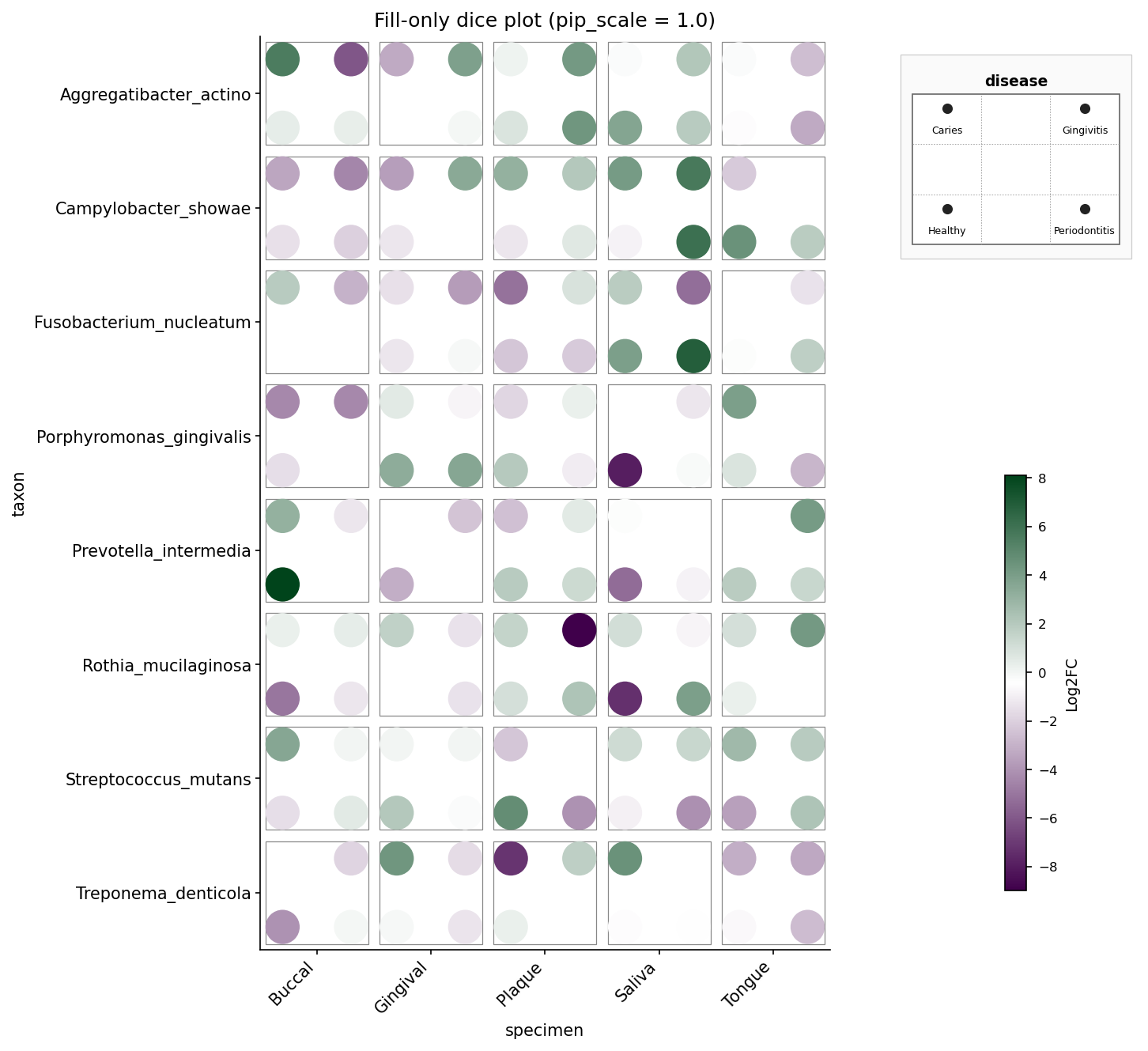
Oral microbiome, fill-only — same data but size is constant and
pip_scale=1.0 fills the die face fully. Mirrors example4_fill_only.png.
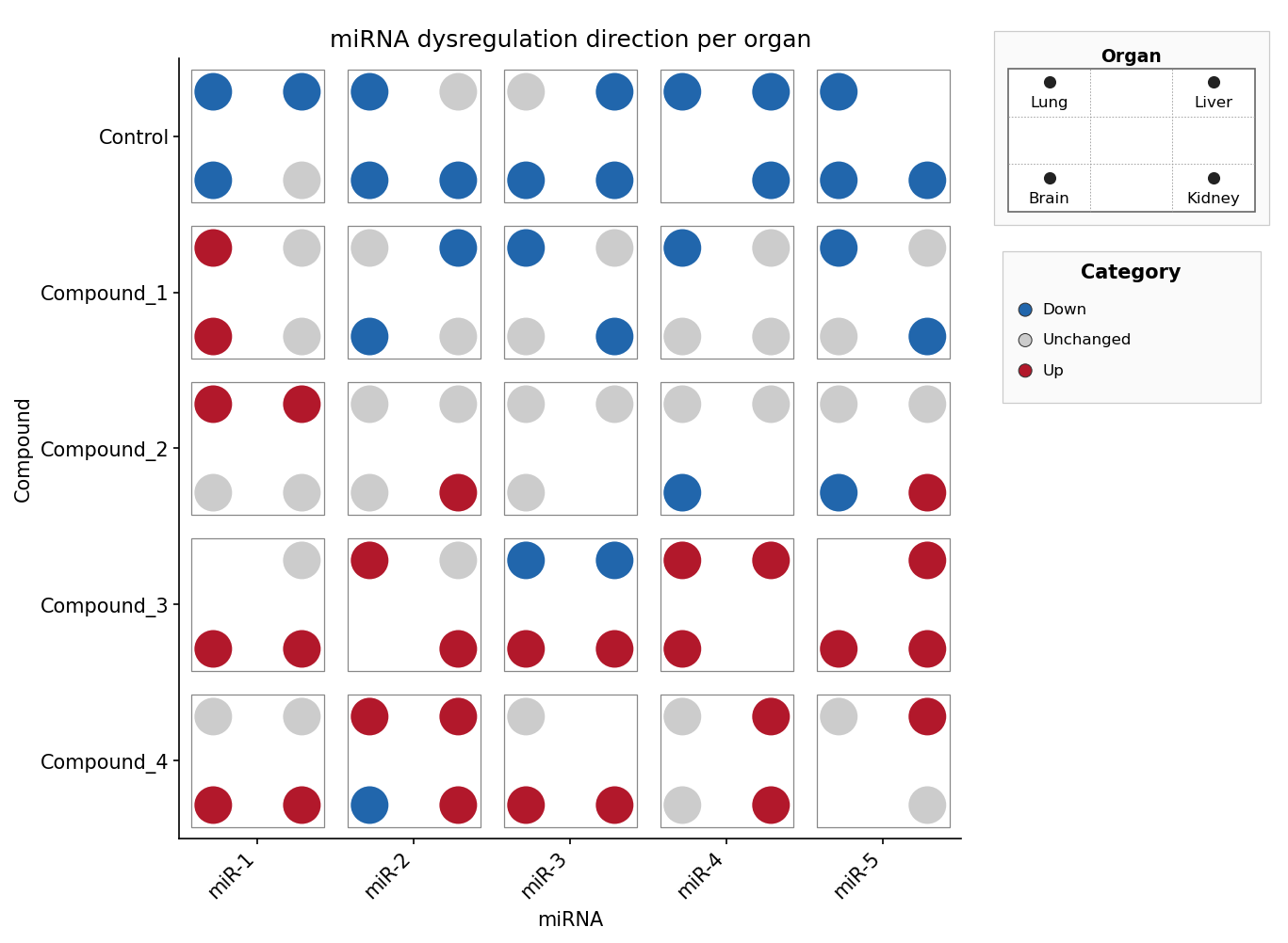
miRNA × compound × organ, discrete direction — the pip slot selects the
organ, the pip colour encodes the regulation direction (Down / Unchanged /
Up) via fill_palette. Mirrors sample_dice_miRNA.
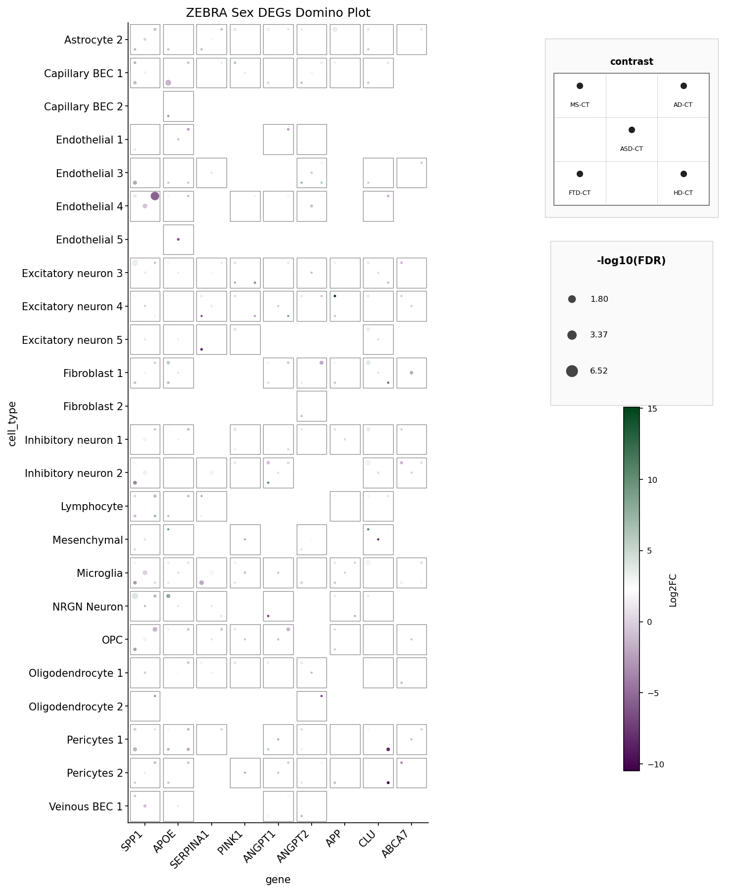
ZEBRA Sex DEGs domino plot — 9 genes × 27 cell types × 5 disease
contrasts, filtered to PValue < 0.05. Mirrors ZEBRA_domino_example.png.
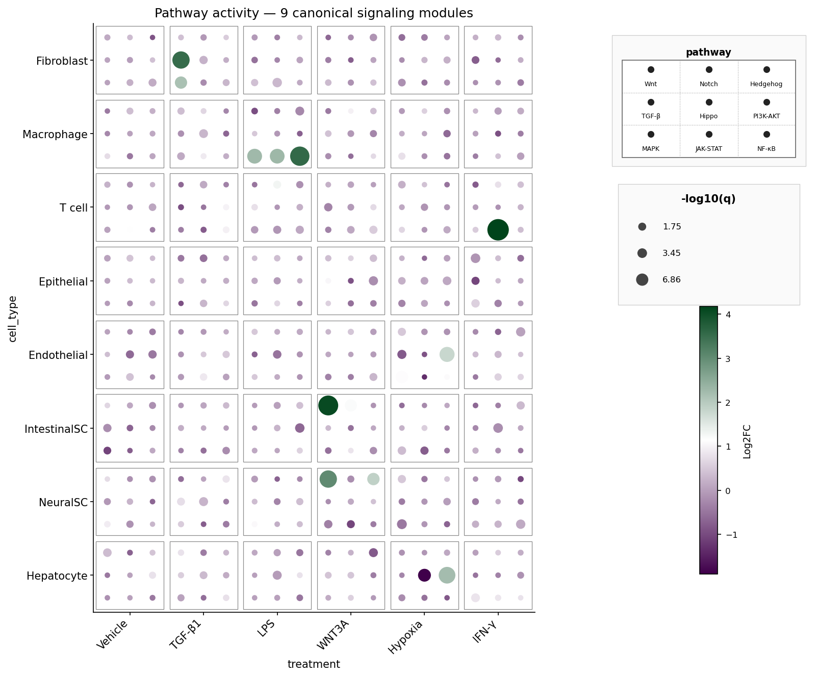
A fully populated 3×3 die face: nine canonical signaling pathways (Wnt, Notch, Hedgehog, TGF-β, Hippo, PI3K-AKT, MAPK, JAK-STAT, NF-κB) per cell-type × treatment tile. Pip colour = Log2FC, pip size = -log10 q. The synthetic data boosts biologically plausible pathway hits: fibroblasts respond to TGF-β1 via TGF-β, macrophages activate NF-κB / JAK-STAT / MAPK under LPS, intestinal stem cells light up Wnt under WNT3A, and so on.
dice_plot(
    data, x, y, pips, *,
    # pip encoding
    pip_colors=None,       # dict {pips value: hex} — categorical colour per pip
    fill=None,             # str — per-pip fill column (continuous or discrete)
    fill_palette=None,     # dict {fill value: hex} — discrete fill lookup
    size=None,             # str — numeric per-pip size column
    # ordering
    x_order=None, y_order=None, pips_order=None,
    # dice geometry
    pip_scale=0.85, tile_size=0.85, grid_lines=False,
    # colour scales
    fill_range=None, size_range=None, cmap="viridis",
    # labels
    title=None, xlabel=None, ylabel=None,
    fill_label=None, size_label=None, pips_label=None,
    # plot target
    ax=None,                  # matplotlib: existing Axes (skips legend stack)
    fig=None,                 # plotly: existing Figure (skips legend stack)
    figsize=None,             # matplotlib: (width_in, height_in)
    width=None, height=None,  # plotly: pixels
    max_pips=9,
)
Returns
- matplotlib:
(Figure, Axes)when we create the figure, justAxeswhen the caller suppliesax=. - plotly:
plotly.graph_objects.Figure.
Use the native save/show methods on the return value: fig.savefig(...) /
plt.show() for matplotlib, fig.write_image(...) / fig.show() for plotly.
domino_plot(
    data, feature, celltype, contrast, *,
    features=None,          # optional feature filter; also sets order by default
    label=None,             # optional hover/annotation column
    fill="logFC",           # numeric fill column
    size="neg_log10_adj_p", # numeric size column
    feature_order=None, celltype_order=None,
    contrast_order=None,    # must contain exactly two contrast values
    contrast_labels=None,   # human-readable labels for those two slots
    switch_axis=False,
    fill_range=None, size_range=None, cmap="RdBu_r",
    title=None, xlabel=None, ylabel=None,
    fill_label=None, size_label=None,
    ax=None,                  # matplotlib: existing Axes
    fig=None,                 # plotly: existing Figure
    figsize=None,             # matplotlib: (width_in, height_in)
    width=None, height=None,  # plotly: pixels
)
Returns
- matplotlib:
(Figure, Axes)when we create the figure, justAxeswhen the caller suppliesax=. - plotly:
plotly.graph_objects.Figure.
The 3×3 pip grid uses natural row-major reading order:
pos 1 (TL)  pos 2 (TM)  pos 3 (TR)
pos 4 (ML)  pos 5 (MM)  pos 6 (MR)
pos 7 (BL)  pos 8 (BM)  pos 9 (BR)
Dice sizes pick from this table (traditional die faces; n=6 is two vertical
columns, unlike ggdiceplot::make_offsets which returns the transposed
two-row layout — we deliberately diverge here):
| n | positions | visual |
|---|---|---|
| 1 | [5] |
center |
| 2 | [1, 9] |
diagonal (TL + BR) |
| 3 | [1, 5, 9] |
diagonal + center |
| 4 | [1, 3, 7, 9] |
four corners |
| 5 | [1, 3, 5, 7, 9] |
corners + center |
| 6 | [1, 3, 4, 6, 7, 9] |
two vertical columns |
| 7 | [1, 3, 4, 5, 6, 7, 9] |
6 + center |
| 8 | [1, 2, 3, 4, 6, 7, 8, 9] |
3×3 minus center |
| 9 | [1, 2, 3, 4, 5, 6, 7, 8, 9] |
fully populated 3×3 |
If you use this package, please cite:
M. Flotho, P. Flotho, A. Keller, "DicePlot: a package for high-dimensional categorical data visualization," Bioinformatics, vol. 42, no. 2, btaf337, 2026.
@article{flotho2026diceplot,
  title   = {DicePlot: a package for high-dimensional categorical data visualization},
  author  = {Flotho, Matthias and Flotho, Philipp and Keller, Andreas},
  journal = {Bioinformatics},
  volume  = {42},
  number  = {2},
  pages   = {btaf337},
  year    = {2026},
  publisher = {Oxford University Press}
}ggdiceplot— the R / ggplot2 siblingkuva— a Rust plotting library that ships a dice plot
MIT — see LICENSE.