
A collection of beautiful and customizable loading dialogs for Jetpack Compose, including the iconic KITT running light from Knight Rider!
This library provides a set of ready-to-use loading dialogs for your Android applications built with Jetpack Compose. The dialogs are highly customizable and easy to integrate into any project.
- 3 different loading dialog styles: KITT, CIRCLE, and LINE
- Progress indicators with customizable appearance
- Info dialog with up to three buttons
- Easy to implement and customize
- Lightweight and efficient
Add the following to your project's settings.gradle file:
dependencyResolutionManagement {
    repositories {
        // ... other repositories
        maven { url 'https://jitpack.io' }
    }
}Add the dependency to your module's build.gradle file:
dependencies {
    implementation("com.github.nexus421:ComposeLoadingDialog:2.1.1")
}LoadingDialog(
show = showDialog,
onDismissRequest = { showDialog = false },
type = LoadingDialogType.KITT // Default type
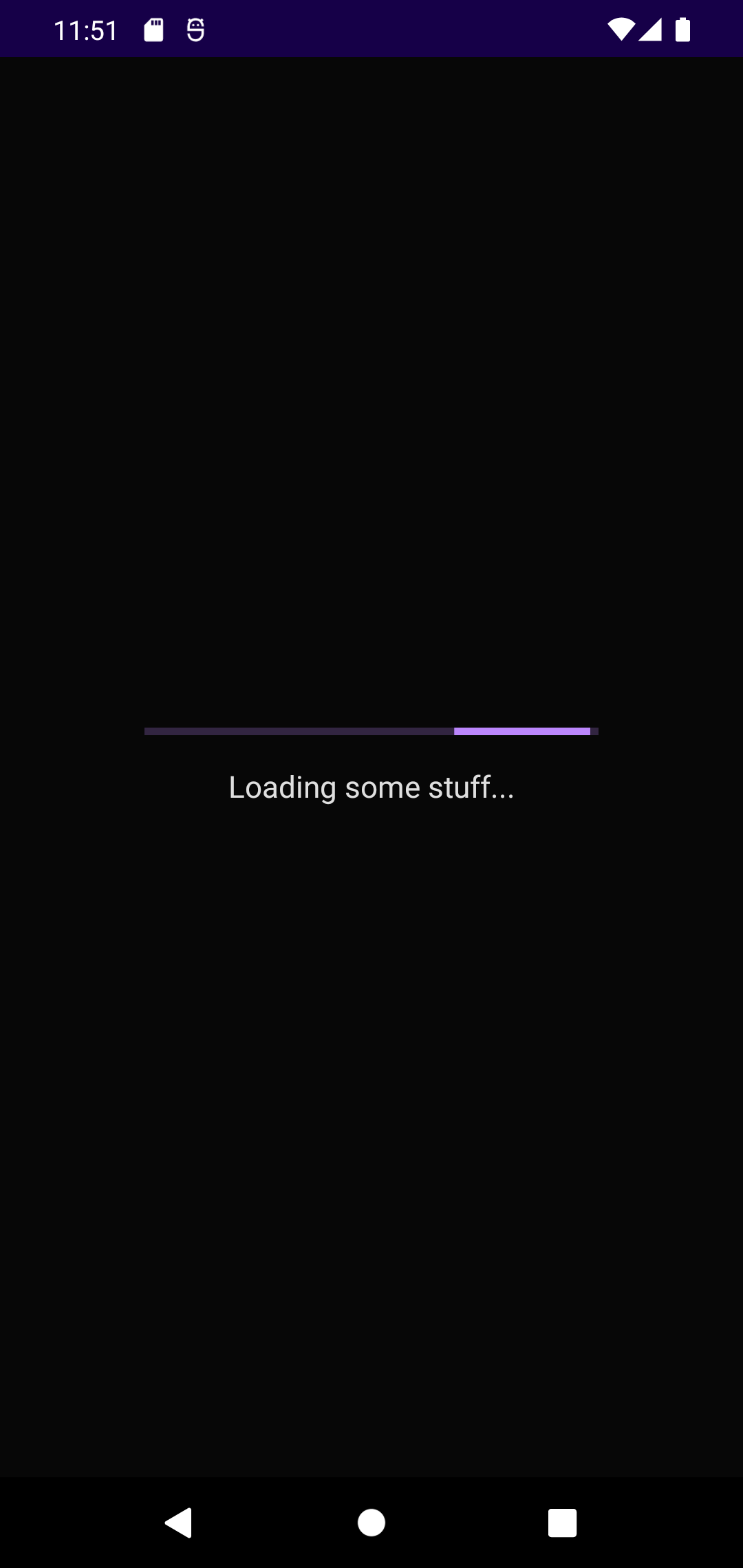
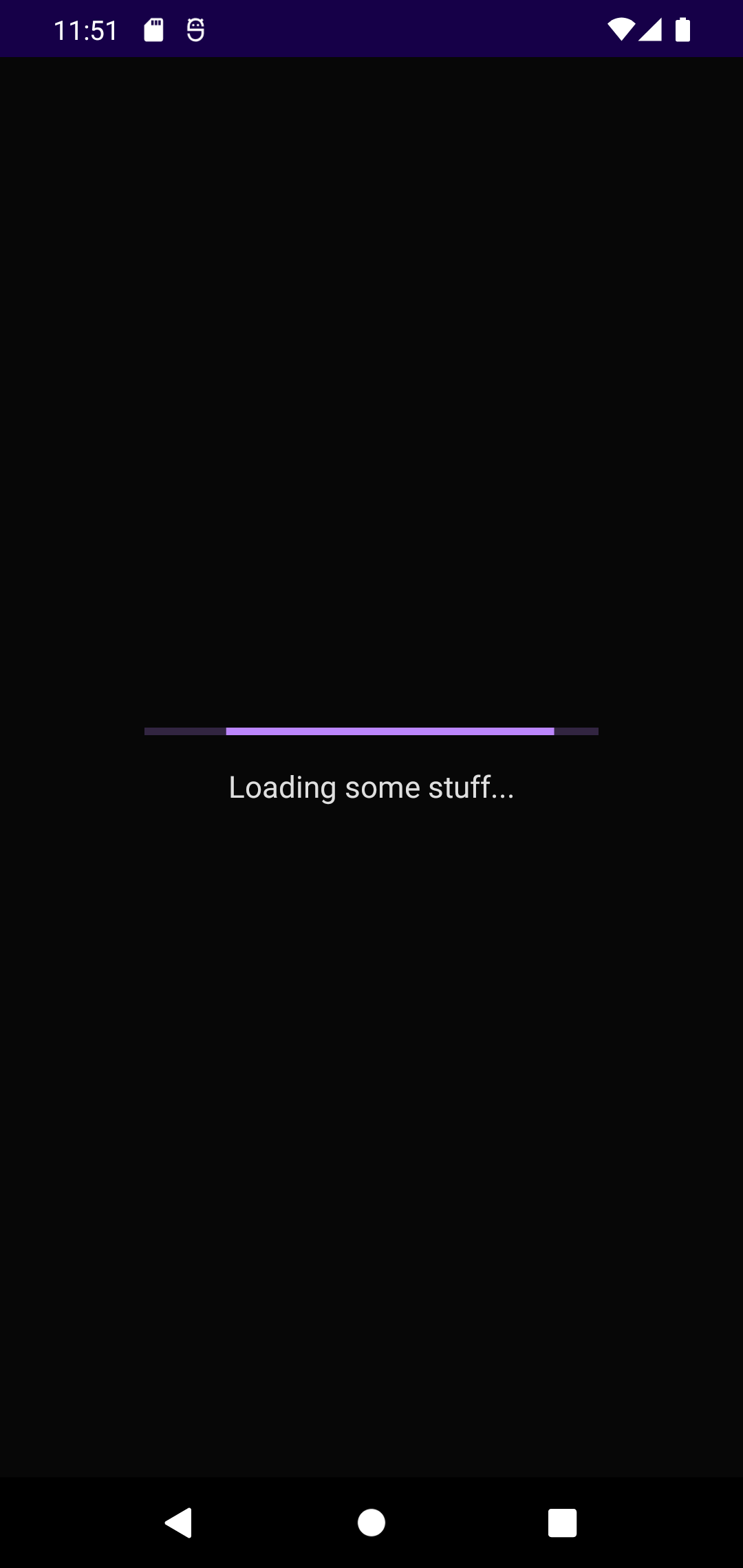
)LoadingDialogWithProgress(
show = showDialog,
progress = 0.75f, // 75% progress
onDismissRequest = { showDialog = false }
)InfoDialog(
show = showDialog,
title = "Information",
message = "This is an example message",
onDismissRequest = { showDialog = false },
positiveButton = "OK" to { /* action */ }
)The KITT loading dialog features a running light animation inspired by the iconic KITT car from Knight Rider. This is the default and my personal favorite!
A circular loading animation that's perfect for most loading scenarios.
A linear loading animation for a more traditional loading experience.


For more detailed information, check the code documentation. Enjoy using these dialogs in your projects!