CACAO: Dashboard tutorial
CACAO is a web platform developed to gather information according to multiple templates that are designed by the tax administrations. Given this flexibility, different data structures may be stored in its internal database.
CACAO also provides a dynamic tool for querying the data, displaying charts and producing reports through the concept of " DASHBOARDS".
By means of a 'DASHBOARD' it's possible to build several chart panels and tables, interactively, where users can apply different filtering criteria, inspect details of the information presented and export data to be used in other external tools.
One 'DASHBOARD' view is made of one or more 'VISUALIZATIONS'.
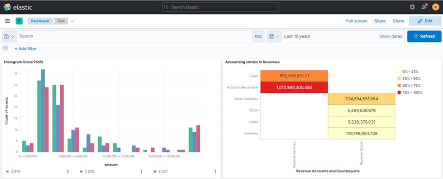
The picture below shows an example of a Dashboard built in CACAO displaying two visualization charts.

Depending on the user's profile, it's possible to access previously created and shared DASHBOARDs in order to visualize it, do modifications or even create new ones.
Currently the following user profiles are able to CREATE or EDIT dashboards:
- System administrator
- Master Government authority
- Technical Support
- Government authority
The following user profiles may only 'visualize' existing dashboards that have been shared through hyperlinks:
- Declarant
IMPORTANT : in order to access the DASHBOARDS area, the user must also have some 'taxpayer identification number' assigned to him at the users' page. The system requires this information because the 'private space' is internally assigned to a unique name, which in turn is based on the user taxpayer identification number. The only exception to this is the initial system administrator 'super user' account.
DASHBOARDS are stored in specific SPACES within CACAO. Depending o the chosen 'space', other users may or may not have access.
The different space options may be:
- Private
- Public
Each user designated with a profile capable of creating or editing dashboards (according to previous chapter) owns a private 'space' identified by his own name. Dashboards created in the private space are only seen by the user himself. Other users of the system cannot access dashboards created in the private space. This is a suitable place to try dashboard creation without interfering with other users' work.
In addition to the private spaces, there are also public spaces. Different users can have access to dashboards created at public spaces.
Currently the following 'public spaces' are defined at CACAO:
- Tax Administration: Master Authority Space
- Tax Administration: Public Space
- Declarants: Public Space
- Default
Dashboards created or copied to the ' Declarants: Public Space' can be consulted by users in these profiles:
- System administrator
- Master Government authority
- Technical Support
- Government authority
- Declarant (only via shared hyperlink)
Dashboards created or copied to any of the other public spaces can be consulted by users in these profiles:
- System administrator
- Master Government authority
- Technical Support
- Government authority
WARNING : The same DASHBOARD can be copied to more than one SPACE. It's analogous to files and directories, where the same file can be copied into different directories. For example, a DASHBOARD that was created in a user's private area, accessible only by the user himself, can be copied by that user to a public area, making it accessible by other users. Any modifications made to a dashboard in one space do not propagates to its copies in other spaces.
Dashboards are displayed on screen in one of two possible modes:
- VIEW MODE
- EDIT MODE
This affects the buttons and menus that are displayed. In the 'VIEW MODE' there are buttons and menus related to the visualization. The user may interact with this controls, adjust the visualization, but can't store these adjustments or modifications. In 'EDIT MODE' the user can modify the stored panel, including the option to include new visualization panels.
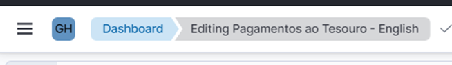
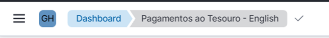
It's possible to recognize under which 'mode' the dashboard is being displayed. The hint is to look at the top of the dashboard. If next to the word 'Dashboard' there is the word 'Editing', this is 'EDIT MODE'.
EDIT MODE:
VIEW mode:
WARNING : Whereas you can view and edit dashboards on a mobile cell phone, it's not advisable to do so. The small screen size of a mobile phone makes it difficult to use important dashboard features. It is recommended to use a computer, notebook, or tablet, where the screen size is larger.
It's possible to type titles and labels on dashboards in any language – the user decides what to type in. Although, the dashboard building tool is presented in English. This means that buttons and other viewing aspects will remain in English.
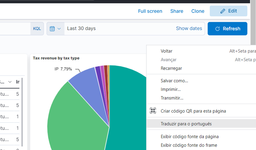
For non-English speaking countries it may be a problem. This problem may be solved by using some 'translation' feature or extension attached to the web browser itself. For example, Google Chrome and Microsoft Edge web browsers provide integrated translation feature:
For example, in Google Chrome it's possible to turn on the language translation by right-clicking on an empty area of the Dashboard (e.g. next to the dashboard name) and choosing the 'Translate to…' option. For example, let's say one wants to translate all the buttons and controls to Portuguese:
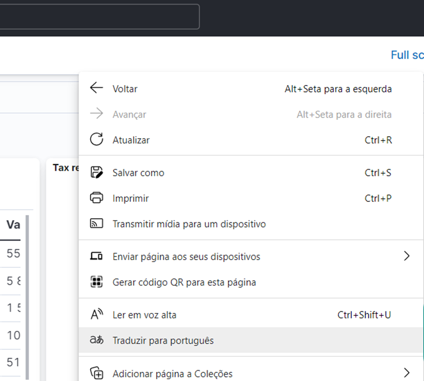
This feature may be turned on likewise using Microsoft Edge:
Tip : Once enabled, the Microsoft EDGE browser keeps translating any other window, which includes the settings popup windows.
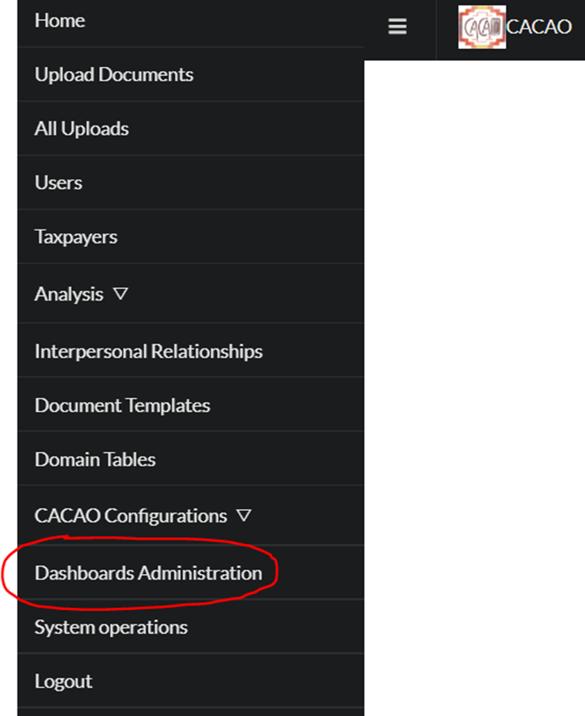
All users except those with 'Declarant' profile may access the Dashboard area using these steps:
Click on the CACAO menu icon on upper left corner, then choose ' Dashboards Administration' menu item.
Users with 'Declarant' profile do not have this menu option available. These users are restricted to accessing dashboards shared through hyperlinks and stored at the Declarant's public space.
Under 'VIEW MODE' there are some controls displayed allowing the user to perform several operations. Here in this chapter, some very basic concepts will be explained.
Top context buttons

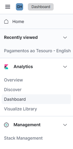
At the top left of the screen there is a button that gives you access to the context menu. This is a navigation shortcut to other available forms of visualization. Depending on the user's profile, the options displayed in the context menu may be different.
Next to the context menu icon there is another button with a few letters inside. This is the indicator of the current ' space' used for dashboard storage. For example, if your name's initials are presented, this is your own private space. By clicking on this icon, you can switch to another accessible space.
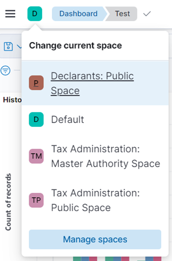
If you want to switch from your private space and access a public space, just click on the name of the desired public space. For example, in the previous picture it would be possible to switch to the 'Declarants: Public Space' by clicking on it.
WARNING : Whenever changing the current space, CACAO displays only the dashboards of the chosen space. If you want to go back to the previous space, click this button again and choose the name of the previous space you were before.
Next to the space indication you can see the name of the dashboard being displayed (as long as there is some dashboard being displayed).
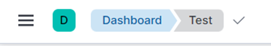
If you want the list of all the existing dashboards in the current space, simply click on the word 'Dashboard' that is displayed in this part.
Still at the top of the screen, to the right, there are several menus and buttons. The choices being displayed also varies according to the user's profile.

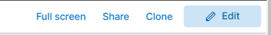
Users with profile capable of creating and editing dashboards will also see the 'Edit' button. It can be used to switch a dashboard from 'VIEW MODE' into 'EDIT MODE'.
We'll see in another chapter how to edit a dashboard. For now, let's stay on 'VIEW MODE' and see other features related to visualization.
Still at the top, to the right, just below the controls mentioned before, there is the ' temporal criterion filtering control'.
Using this control you can set the start date/time and end date/time for the period of interest. This choice affects all the dashboard's visualizations being displayed.
You can click the mouse button over the larger text field showing the currently applied temporal criterion.

If you click the text that appears to the left of the little arrow, you are editing the starting temporal criterion.

If you click the text that appears to the right of the little arrow, you are editing the ending temporal criterion.
Hint : if you are not seeing any arrow at all, just do a one-click over the text being displayed at this location. It will probably change into another similar sentence including the arrow.
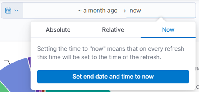
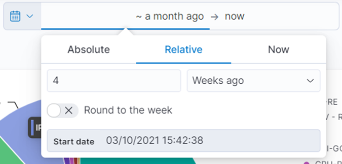
Both temporal criteria (the initial and the final moments) may be defined in similar ways using the options provided on screen:
- Absolute : To indicate a specific date and time (e.g. 01-11-2021 00:00:00).
- Relative : To indicate a period that is relative to the current time (e.g. two months ago).
- Now : To indicate exactly the current time.
For example, if you want to set a period that started 'four weeks ago' and ends now, click on the clause located to the left of the arrow, then click 'Relative', and then fill in the fields to indicate that you want '4 weeks before'.
You can also configure the temporal filter using the 'calendar' button that is displayed on the left of the sentence. This way you can choose one from a set of common criteria (e.g. to choose the criterion 'last 7 days').
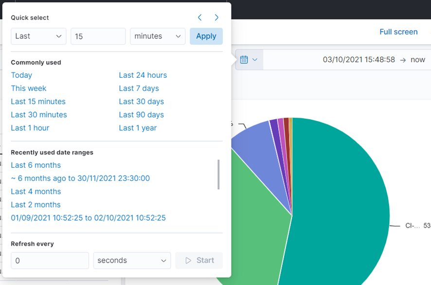
Once the temporal criteria have been changed, you have to click the 'Update' button to make if effective.

Each visualization panel displayed in the dashboard screen can provide more viewing options. To access these options move the mouse cursor over the panel up to the upper right corner. Note that a button with three little dots "…" is revealed, as illustrated below.
One of the viewing options is the 'Inspect'. For any chart displayed on the dashboard, you may view the underlying data at tabular format using this option.
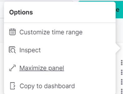
When you do this, a new window is presented with the data in tabular format. The same window also displays additional button allowing you to download the data in CSV format, which is a file format that can be opened in many applications, including Microsoft Excel.
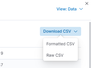
Tip : Sometimes you may find that the dashboard visualization tool lacks some feature you would like to use. For example, making fine-tuned visual adjustments for final presentation. Following the previous steps you can easily export the data to a CSV format , and then import it into EXCEL , where you can use a more complete set of graphics refinements.
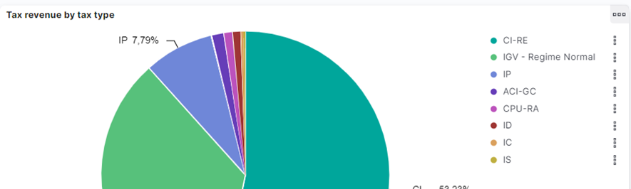
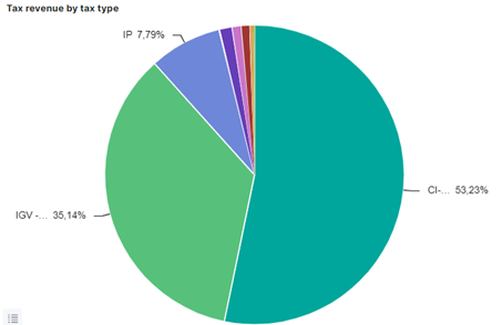
Many of the charts displayed on dashboards have the ' click to filter' feature. For example, by clicking on a 'slice' of a pie chart you can restrict all the visualization panels to only consider data regarding properties of that particular slice. If the slices were related to taxes' names, you would apply a filter over the selected tax.
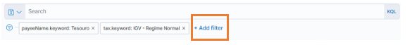
All the filtering criteria that has been applied to the dashboard so far are displayed at the top, to the left, just below the context buttons. This includes those ones resulting from the 'click to filter' feature.
If you want to remove a filter, click on the 'x' that appears next to the filter you want to remove.
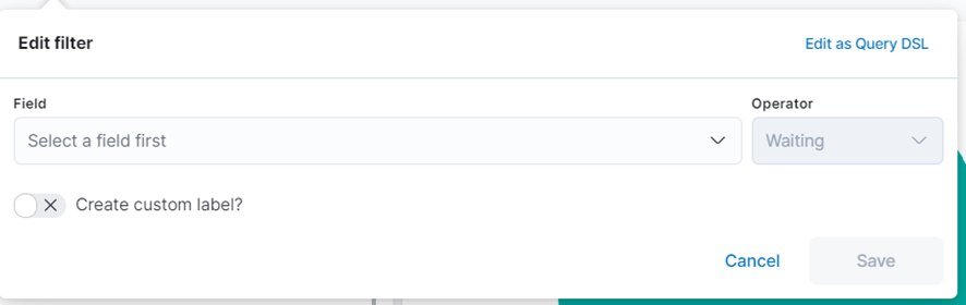
In addition to 'click to filter' on chart elements, you can also add new filters using the '+ Add filter' button that is displayed in this same location.
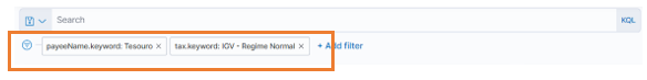
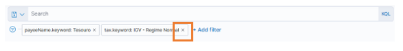
While creating or editing a filter, you have to indicate the 'field name' you want to filter, the type of 'operator' to use, and the 'parameters' for filtering.
For example, the next picture shows how to filter on a field called 'tax' containing words, looking for those records where this particular field contains the word 'IGV'.
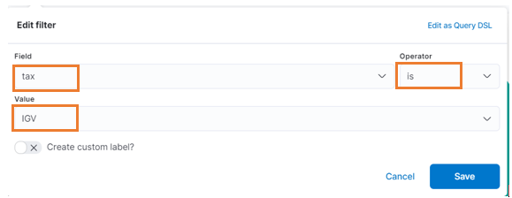
ATTENTION PLEASE : Depending on the type of field you are working on, the 'IS' operator shown above may have different behaviors. In the previous case, the chosen field 'tax' was stored in database in such a way where the multiple words in phrases were previously split. This is the normal internal behavior for all fields representing 'text'. Due to this, the 'IS' operator was equivalent to doing a 'word search' (more like a 'contains' operator). For example, both phrases ' IGV' and ' IGV – special regime' would match the given criteria, because both contains the word 'IGV' that was informed in the previous example. Fields don't always behave the same way. Fields that have the suffix '.keyword' in their names do not split words. So, in this case, the operator 'IS' would actually require that the 'full contents' be equal to the provided argument. So, if in the previous example we have chosen the field ' tax.keyword' in spite of ' tax', the same filter would match ' IGV' but would not match ' IGV – special regime'.
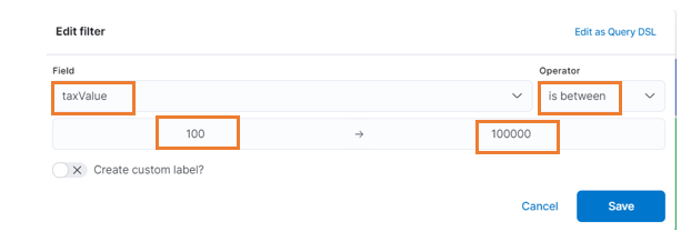
The choices for 'operator' in 'filters' depend on the field type. For example, you can set a 'maximum value' and a 'minimum value' for defining a filter over 'tax values'. Use the 'IS BETWEEN' operator to define value ranges using 'maximum' and 'minimum'. It is also allowed to enter only a maximum value without minimum value, or the other way around.
For example, the setting below indicates that you should only consider data having 'taxValue' in the range of 100 to 100,000.
Back to the dashboard visualization screen, just above the location of the filters you may find the ' Search' field. Using the 'Search' field it's possible to build much more complex search criteria by combining different fields and different expressions in different ways. For example, whenever writing multiple conditions, you may combine required conditions using 'AND' conjunction and optional conditions using 'OR' conjunction.
The platform behind the dashboards is called KIBANA ™. We just surfaced a few very basic features implemented in this platform. There are much more, including advanced features such as a 'query programming language' called ' KQL', which stands for Kibana Query Language. This subject runs away from the scope of this manual. If you are interested on studying more about this, please follow the link below:
https://www.elastic.co/guide/en/kibana/current/kuery-query.html
Before we dig into the dashboard craftwork, it's very important to get to ' know your data'. There is no way to start building dashboards without the knowledge of how the data is structured internally. Very often you will be selecting some fields for either 'aggregation' of 'filtering' purposes. So let's first talk about data fields.
CACAO provides means for collecting data, mainly from the incoming files provided either by taxpayers or by tax authorities.
Once the incoming data has passed through all the several processing stages inside CACAO platform, including the validation stages, it gets published internally for usage in reports and dashboards. The published storage is internally represented by one or more ' indices of documents', or just 'indices'.
For each ' template' that was defined by the Tax Authority using the CACAO interface there is a corresponding internal ' index' for storing the corresponding data. Each index has a unique name. By design CACAO stores published data at indices whose names starts with the prefix ' cacao_pub_'. For example, the template called 'General Ledger' corresponds to an internal index called ' cacao_pub_general_ledger'. The same index is used for storing the entire contents for every file related to the same template. So, for example, if multiple users have uploaded 100 files related to 'General Ledger' template, all their contents will be stored into the same 'cacao_pub_general_ledger' index. Of course there are means for recognizing each one of them.
Every data we put into CACAO has some ' structure' designed by the Tax Authority by the time the templates are defined. The structure of data is composed of ' fields'. Each 'field' has a 'name' and has a 'type'. It's out of the scope of this manual to go into details on how to define templates inside CACAO. But just to give an example, let's say the Tax Authority may have defined a template called 'General Ledger' with the following set of fields - this is just an illustrative example, since the Tax Authority is free to define it in different ways:
| Field Name | Field Type | Meaning |
|---|---|---|
| TaxPayerId | Characters | The taxpayer identification number |
| Year | Number | The fiscal year |
| AccountCode | Characters | The code used to identify the account |
| AccountName | Characters | The name of the account |
| Date | Date | The date of the post entry |
| Debit | Decimal value | The amount being debited |
| Credit | Decimal value | The amount being credited |
| Balance | Decimal value | The final balance after the operation |
One file that conforms to the previous template would probably have several lines (records) with the required contents. Once such file gets parsed by CACAO, its contents are split and placed into the corresponding fields of the provided structure. For each field defined in the template there will be a corresponding field in the internal index where all the data is stored.
The actual field names we will be working on are derived from the field names that are provided at the template definition. They are always in lower case and the different words are separated by underlines. If the original field name contains lower cases followed by upper cases, they are considered as word boundaries. So, according to the previous example, these are the actual field names we would see once we start working on them through dashboards:
| Original Field Name | Actual Field Name (for using in Dashboards) |
|---|---|
| TaxPayerId | tax_payer_id |
| Year | year |
| AccountCode | account_code |
| AccountName | account_name |
| Date | date |
| Debit | debit |
| Credit | credit |
| Balance | balance |
There is just one more detail regarding data fields that will be very important when designing dashboards. All the fields containing 'texts' are actually represented as two different fields, with slightly different names. There will be one field whose contents gets broken into words and another one to hold the entire contents – the latter including the suffix ' .keyword' as field name.
So, for example, if a particular file provides the phrase 'CURRENT LIABILITIES' as a value for a particular field (suppose we are talking about the field 'AccountName'), it will be stored as two fields: one field called 'account_name.keyword' will hold the entire contents 'CURRENT LIABILITIES' whereas another field called 'account_name' will hold the words 'CURRENT' and 'LIABILITIES' separated. The reason for this is to ensure the best performance for searching for partial contents. So, let's say, if we were interested on searching on the partial word 'LIABILITIES' (what is usually the case for searching data), we would use the field 'account_name', which would match the original content 'CURRENT LIABILITIES'. But if we were interested on the full contents (what is usually the case for aggregations), we would use the field 'account_name.keyword'.
HINT : Usually for any arbitrary text field called XXXX we will be using the 'XXXX.keyword' field for doing 'aggregations' and we will be using the 'XXXX' field for doing 'filters'.
For completeness, these are the fields that would be generated internally given the previous example:
| Original Field Name | Actual Field Name | Use for… |
|---|---|---|
| TaxPayerId | tax_payer_id | |
| Filters based on taxpayer partial id | ||
| tax_payer_id.keyword | ||
| Filters or aggregations based on taxpayer full id | ||
| Year | year | Filters or aggregations based on year |
| AccountCode | account_code | |
| Filters based on account partial code | ||
| account_code.keyword | ||
| Filters or aggregations based on account full code | ||
| AccountName | account_name | |
| Filters based on account partial names | ||
| account_name.keyword | ||
| Filters or aggregations based on account full name | ||
| Date | date | Filters or aggregations |
| Debit | debit | Filters or summarizations |
| Credit | credit | Filters or summarizations |
| Balance | balance | Filters or summarizations |
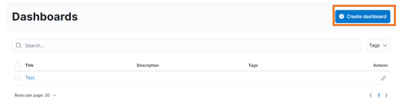
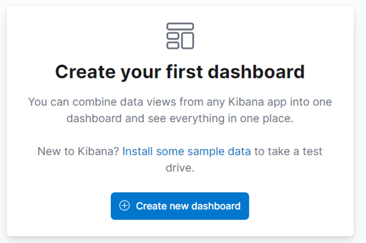
In order to build a dashboard, use the ' Create dashboard' button located on the dashboards main page.
If this is your first time creating dashboards in CACAO, the dashboard button is probably displayed as illustrated below:
The initial screen for dashboard creation looks like the following picture.
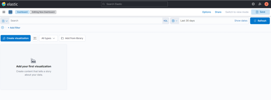
A DASHBOARD consists of one or more VISUALIZATIONS. Each visualization can be a chart, a table or a block of text. The dashboard crafting consists of creating and configuring visualization panels one by one.
TIP : The visualization panels you create for one dashboard may be reused in another dashboard.
To create a new visualization panel in the current dashboard, click the ' Create visualization' button.
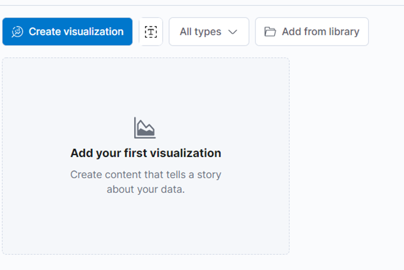
This will open the window for building a visualization, where you will spend most of your time crafting dashboards.
Before we move on to the details about this window, let's look at the main parts.
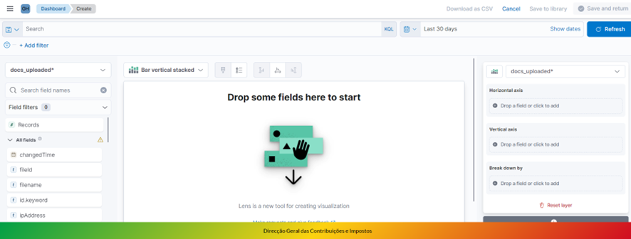
In the upper left corner you have a selection box that you use in order to indicate which 'database' contains the data we would like to work on. For example, if you were willing to build a chart based on the declared statement of incomes financial reports, you would look for something like ' cacao_pub_accounting_declared_statement_income'.
Tip : In the editing tool, we use the term ' index pattern' to refer to a 'database'.
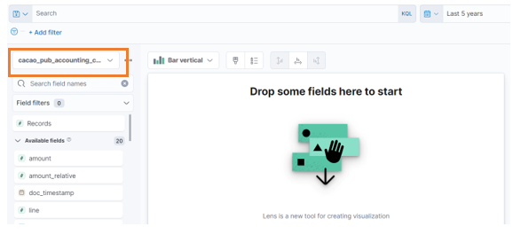
Just below the box indicating the 'database' (i.e. the 'index pattern'), to the left of the window, there is a panel listing all the fields defined on it. When you switch to a different database, the field listing gets updated.
TIP : if you are not seeing any field at all after choosing a database, please make sure the temporal criteria defined above the screen is large enough for matching your data. For example, if this temporal criteria says something lake 'last 10 minutes' and if your data is related to the past year, you won't see anything (not even the fields list) because there won't be any data matching your criteria. In this case, just change your temporal criteria (for example, configure it to be something like 'last 5 years').
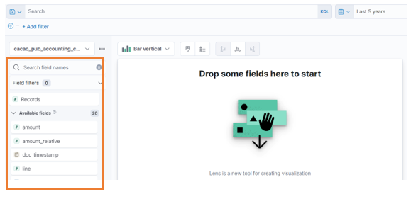
TIP : Depending on the database you choose, there may be many fields in this list (perhaps hundreds of fields). To make it easier to find fields, use the " Search field names" box to find fields by typing their names.
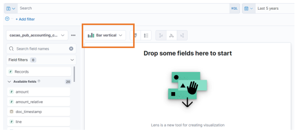
Just about the middle of the screen you will find the selection box used for choosing a type of chart. This is where you indicate which type of chart you want to represent in this visualization. There are several options, including pie charts, box charts and even tables.
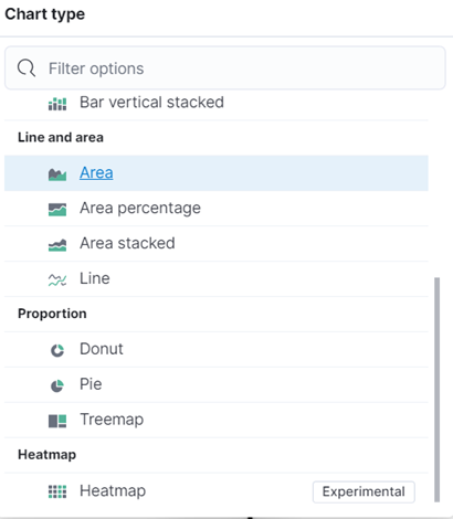
Actually, these are just the 'basic charts'. It's possible to build more complex charts using other advanced techniques, but it's out of the scope of this manual.
To the right-hand side of the window you will find all the settings and options related to the type of chart you are working on. For example, if this is a chart of 'vertical bars', you will choose fields to separate data over the horizontal axis (i.e. the criteria for defining the vertical bars), fields to compute the vertical axis (i.e. the size of each bar) and optionally additional criteria for breaking down those bars.
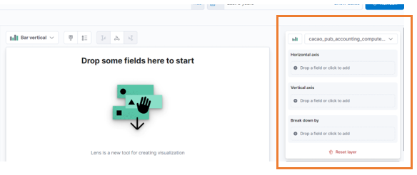
At the central part of the window you will see a preview of the current visualization. It there is not enough data to display a chart, it will simply show a message 'Drop some fields here to start'. But as you proceed with the configurations, the chart will eventually be drawn and gets updated after each change of the settings.
Sometimes it's possible to build visualizations very quick by simply ' dragging and dropping' fields from the left side 'field panel' into the central panel.
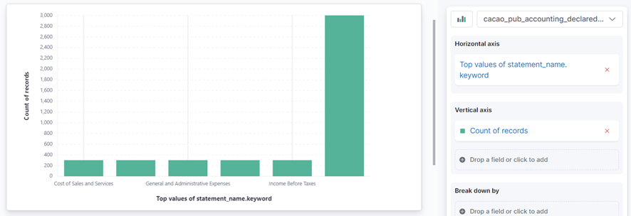
For example, let's say we are working with an index pattern called 'cacao_pub_accounting_declared_statement_income' that corresponds to the 'Statement of Comprehensive Incomes' declared by taxpayers. Suppose we have a field called 'statement_name.keyword' corresponding to the name of any entry informed in the Statement of Comprehensive Income (e.g.: 'Cost of Sales', 'Income Before Taxes', etc.). If we just drag and drop this field into the central panel, it would probably show a chart like this one, with bars representing the criteria we just chose (the name of each entry in the Statement of Incomes) and the size of each bar chosen arbitrarily as a 'count of records'.
In a real case scenario we would probably be more interested on computing the total 'amount' of values for each entry, and not just counting the number of records. We can easily fix that. First we would just drag and drop the desired metric (let's say there is a field called 'amount') into the corresponding spot at the right panel (the one indicating the 'Count of record' as 'vertical axis' criteria). With this simple action the chart would change into something like this:
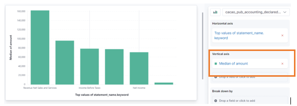
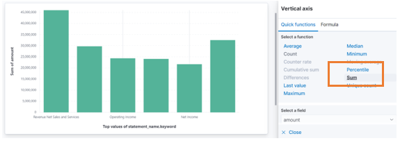
By default the metrics are computed by their 'medians', and we can see this by looking at the phrase inside the box beneath 'Vertical axis' settings – in this example it says 'Median of amount'. If we are more interested on the 'sum', we can simply click on that particular phrase (it's actually a hyperlink) and select the 'Sum' function for that criteria.
It's very easy to change different aspects of the chart by just repeating these drag and drop steps, followed by customizations performed on the right-hand side of the screen.
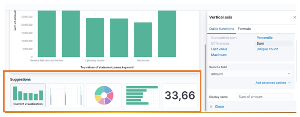
Eventually the lower part of the screen will also present some alternative choices of charts that may replace the current view. You may quickly switch to a different type of chart by clicking on one of these options, keeping most of the current settings as they are.
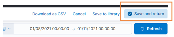
When you think you are already done with the visualization, just click the ' Save and return' button at the top right corner of the window. This will save the current visualization panel and put you back to the 'dashboard' initial area – remember that a DASHBOARD is a SET OF MULTIPLE VISUALIZATIONS, and all this time you have been editing just a single visualization.
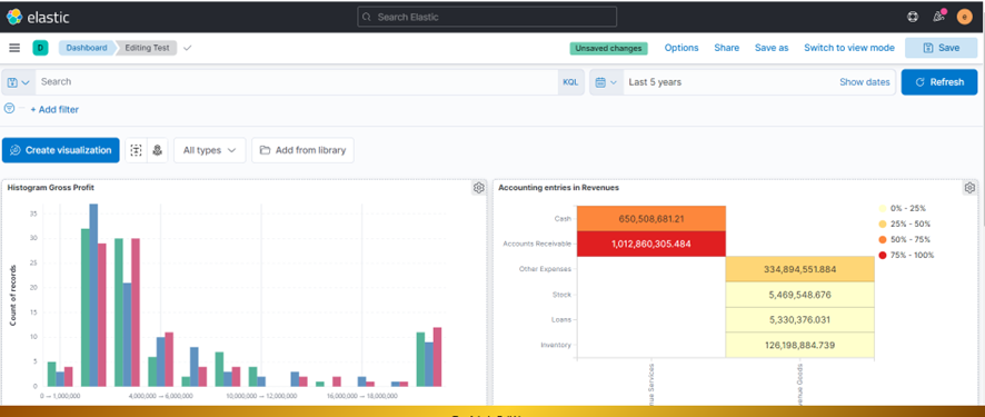
You may repeat all this process over and over again, including more visualization panels to the same dashboards. They may be of different types. The following picture shows two different visualizations (of different types) at the same dashboard view.
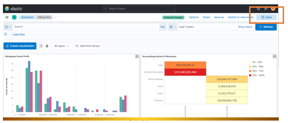
Once you think you have finished your DASHBOARD, get back to the screen where the 'Save' button is (look at the upper part of the screen) and press it.
When saving a DASHBOARD, you have give it a name.
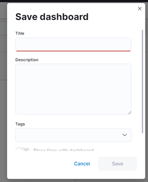
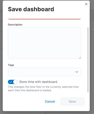
Tip : If you want to save along with the dashboard the time interval that was used as a time filtering criterion, check in the option below before saving.
There are two different actions regarding sharing and copying DASHBOARDS with two different outcomes:
- Creating a hyperlink to a dashboard
- Copying the dashboard to another space
The hyperlink is just a 'shortcut' to bring the DASHBOARD up. It's equivalent to going through all the steps until you reach the Dashboard, but you can do it with just one click. It does not bypass the access control. For example, if the dashboard was created at a user's private space, any other user won't be able to access it, even though they may have the shortcut hyperlink (it would be a 'shortcut to a dead end').
' Copying' is the way to make one DASHBOARD available in a 'public space', so that other users may have access to it. So, if you want to share with others a DASHBOARD by a hyperlink, you must copy this first to a public space, switch to that area, and then create a shortcut for that copy (it will be a different hyperlink than what you would get from your original copy).
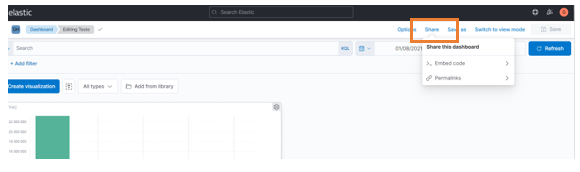
To share a DASHBOARD via hyperlink , open the dashboard in 'EDIT MODE' and click 'Share' at top right corner of the screen.
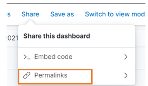
Within the ' Share' options menu choose the ' Permalinks' option.
In the next window, you can make some choices, as explained below.
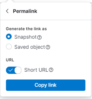
Choose:
- Snapshot : If you want to share a 'frozen' version of your dashboard. Later modifications to the dashboard will not affect the version being shared.
- Saved object : If you want to share a version that can be modified later, by you or someone else who has permission to edit the dashboard in this space.
If you choose ' Snapshot', you can enable the ' Short URL' option in order to generate a short hyperlink. Otherwise, it will generate a long link (i.e. a long string of characters). Either way, be it a short or long version, the link behaves the same. There is no difference to the operation of the dashboard. Short links are easier to copy in messages through.
Tip : Sharing a hyperlink is not enough for granting access to a Dashboard to other users. You must first copy the dashboard to a public space if you intend to do so.
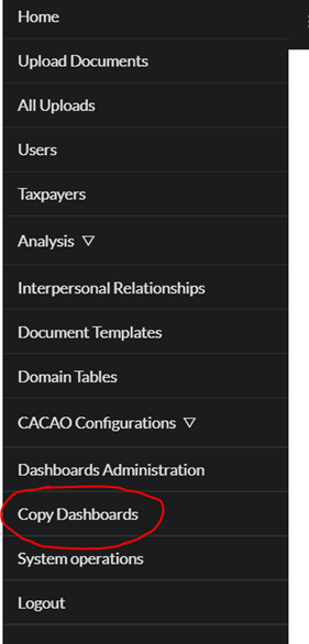
In order to 'copy' a DASHBOARD, go to the CACAO menu and look after the ' Copy Dashboards' option – this option is available depending on the user profile.
In the ' Copy Dashboards' window, all the dashboards you have access to are listed. There may be dashboards in different spaces – your private space and any public spaces you have access to. All of them will be listed on the same screen.
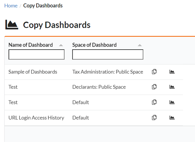
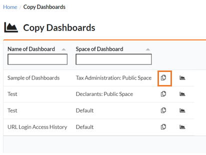
Search in this list for the dashboard you want to copy and click on the corresponding 'Copy' button.
In the next window, check all the 'spaces' to where you want to copy the dashboard. A new copy will be made for each of the chosen spaces.
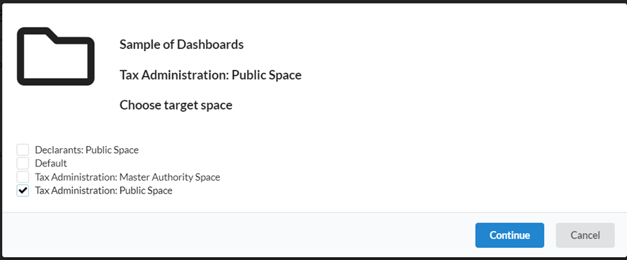
Click the ' Continue' button to perform the copy operation.
Note : After copying the DASHBOARD, any changes made to the original one do not modify the copies, and vice versa. You will need to copy the dashboard again after modifications if you want to propagate them to be reflected in other spaces.